Data Analysis, RFC 2019 dataset. Nutritional Quality regressions over spectral profiles

Hello, everyone!

We’d like to periodically share our progress over this analysis as there are lots of possible ways to advance over what’s available, it’s very useful to share ideas, get some feedback and also know, compare and test each others hypotheses.

Repository: https://gitlab.com/our-sci/rfc-docs/-/tree/master
Results (download and open in web browser): https://gitlab.com/our-sci/rfc-docs/-/raw/master/2019/dataAnalysis.html?inline=false

Our results would be mostly available in the dataAnalysis.html file inside our gitlab repo, where you can find associated R objects also.

We have begun with some fundamental steps to make the data available, mostly merging, cleaning, formatting and elimination of outliers. The data is now organized as can be seen in our spectral curves plots. The curves have been clustered by derivative sign successions in order to spot the most obvious patterns. In these plots we observed some curious behaviour which we are still analyzing but for now we mostly classified the most peculiar patterns as atypical data.

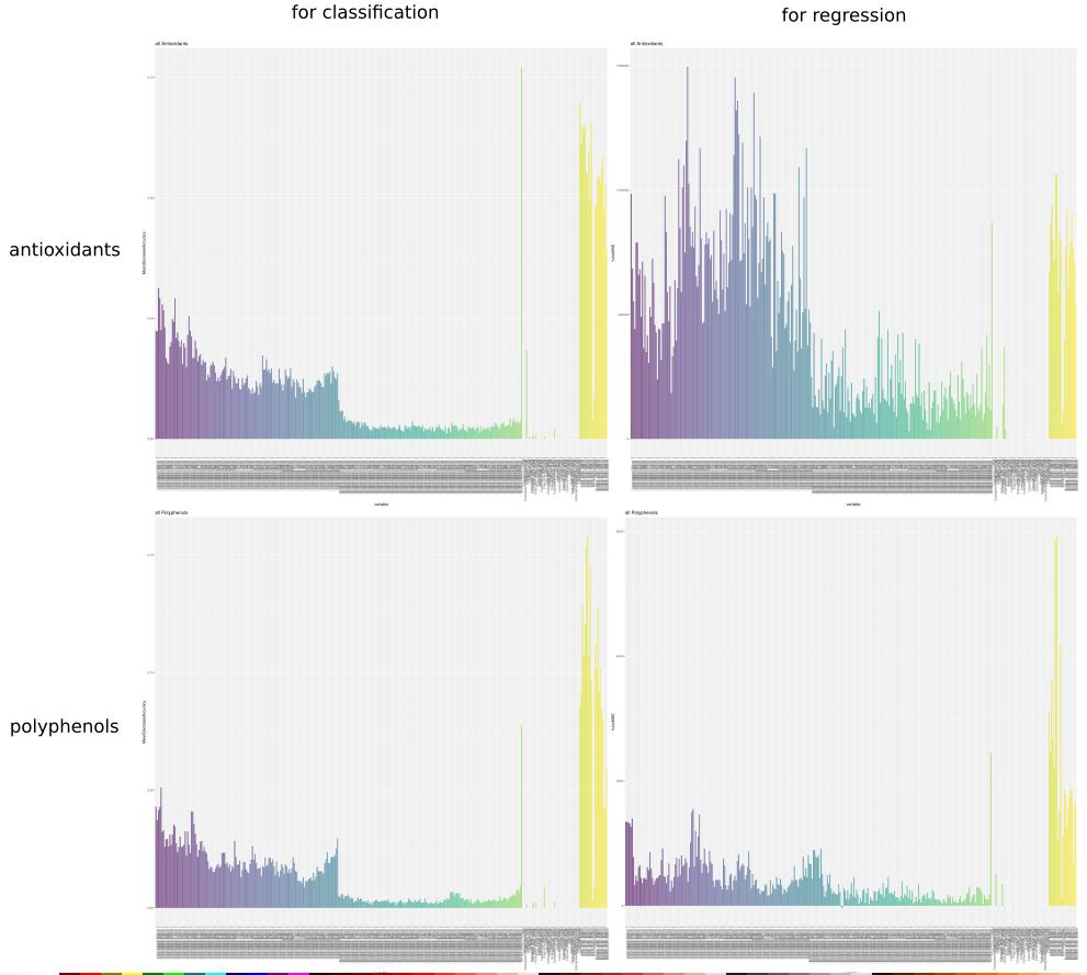
Our first target is to predict Polyphenols and Antioxidants contents using data obtained through the Our Sci’s spectrometer. We’ve already done exhaustive modelling work, over a great number of subsets of available dimensions (mostly combinations of OurSci’s spectra, the SWIR spectra measured with the SIWARE device and metadata as produce color) with a variety of available statistical models. We’ve organized a powerful testing framework which enabled us to run hundreds of thousands of modelling instances, with repetitions aimed at reasonable levels of cross validations ( 15 folds ) in order to avoid bias and overfit as much as possible. If you’d like us to run some particular model you believe would be suited for this situation and we haven’t tried, please let us know, we probably can run it using the same procedure without a great effort.

This is still a testing stage in which we are searching for the most promising models. This is the reason you’ll find some unreasonable models inside the tables, for example models that are clearly overfitted. This also allowed us to see, for example, that our cross validation was effectively differentiating overfitted linear models with ease (you can see this looking at the original rsquared column in the linear models table, in comparison to the cvRsquared one).

Special effort has been made to fit the classical linear models, first shown in the brief in a tentative ANCOVA fit, then detailed over the modelling section. A variance stabilizing transformation has been tried (without interesting outcomes) and a shallow essay over robust modelling has been carried, this one with an interesting reduction of 20% over the variance, without any special tuning. Robust fitting and outliers weighting is one of the directions we will explore further.

We’ve done preliminary work over deep learning models such as Neural Networks and Support Vector Machines, calibrating the same system we used for massive modelling iteration and looking for reasonable tuning ranges for the hyperparameters. We’ll offer a similar broad survey over these models. As involved calculations are exceedingly heavy, with these sections we started a new organization where the heavy modelling work will be done on separate files. This one is not finished and is still unmerged with the main document, in a separate modelling folder on the same repo.

We originally anounced promising results on our Random Forest models, this was mostly due to a failure in distinguishing repeated measurings in the dataset when doing cross validation. Event though they still show a superior fit than linear models, neither of them offers a working solution.

Up to this moment, no modelling solution has shown a conclusive, practically useful result . We’ve gone back gone back to check at the state of the art in similar problems and decided Functional Data Analysis seems to be the most promising solution. The expertise gained in working with this particular dataset and the iterative tidying and organizing steps these investigations have required have left us well equipped to test for further hypotheses and proceed with this new modelling options in shorter time, so hopefully we’ll soon see if this path is more fruitful.

These are some of the steps we’ll take during this week, until this Friday

  1. Finish a new round of outlier detection, searching also for “shape” outliers, that is curves that are between the acceptable ranges but have an unusual geometry/behaviuor. In general, we will attempt a better curing of the curves sets, we’ll try to explain the bottom clustering observed on most datasets and asses if it’s reasonable to attempt normalization (profiting on the existence of shared heavy absorption bands) or if we should split those sets over different models.
  2. Try functional regression solutions and assess their precision through a consistent validation framework. Recent literature suggests that this is the better suited theoretical framework.
  3. We’ll resort more systematically to available metadata, especially Brix content and produce color. We’ll see if dry mass percentage adds considerable predictive power, taking into account it’s less practical to implement for massive use of the model. We are also checking if processing time explains some of the unsual patterns.
  4. We’ll try to increase the power of our quantile predictions by increasing the number of quantiles and splitting into three bands (inferior, center and superior one).

We are looking forward to also hearing from your findings and observations and wish you luck in your own investigations.

1 Like

Just as more background, we’ve had more discussion here: https://gitlab.com/our-sci/rfc-docs/-/issues/3. Please don’t respond there (respond here!), I’m posting just for reference.

Once we are done with traditional inference, it’s probably worth it to try with functional data methods. I was a little scheptic of it usefulnes for this situation but I’ve seen some interesting results on a simmilar investigation.

The most elemental application would be to project into a functional base ( Fourier comes to mind, considering this is spectra after all ) picking elements until a reasonable level of variance is explained and then use the coefficients of this projections as parameters. This allows for a high degree of smoothing and allows to work with actual continous and differentiable functions, so in a way we are getting information for free. I’m eager to see how it impacts on the models.

We kept testing our models and there are reasons to believe precision is below what was originally informed. I’ll be soon posting an updated version with this new more precise testing and some new tooling we’ve added to show atypical data and get tighter modelling.

Octavio - feel free to update the top-level post here - I made it wiki-editable. If there are adjustments needed just keep that post current.

June 5 2020 review of @OctavioDuarte 's work here: https://gitlab.com/our-sci/rfc-docs/-/tree/master/2019

Top level thoughts

  1. In order to decide on what to do with our existing Bionutrient Meter, it would be nice to run uvAll on the best model in thirds (25/50/25), and see the confusion matrix for every crop of interest (can do a bit matrix of confusion matrices - I’ll copy paste and zoom in :slight_smile: . Basically - we just need to hand those numbers to potential partners, bfa members and others and say ‘well… this is what we can do… is this useful?’.
  2. Also… didn’t see it (I probably missed it) was there some discussion / description of impact of shipping time? That was one of the items on the previous list, was curious.
  3. Oh and date vs. those big amplitude changes in the NIR you noticed (two amplitude buckets)

–> My notes -->

Outliers + related

  1. I’ve sent a message to Katie/Mason/Dan to help identify the ‘why’ of the outlier lists you showed. May also help find other issues (in case they are buried in there or something).
  2. It seems that there’s lots of individual missing wavelengths from the carrots data (like only 3 of 10 wavelengths) in the clustering exercise at the top - is that right? must not be - I reviewed carrot data and dno’t see missing wavelngths. I must not be fully understanding the clustering analysis and what it’s doing.
  3. It is clear we have some outliers, and also as you’ve pointed out our SciWare data seems to be clustered into a ‘low’ and ‘high’ set in general. I’d love to have a more real-time dashboard on the spectral scans to help us identify in real time the quality of what we’re collecting, and support the lab better in identifying problems before they go on for too long.
  4. Ultimatley… for the remaining data, did you actually remove any outliers? You applied several methods, but didn’t say explicitely which method you’re using (maybe all, none)? Or did you just create an extra variable for hte outliers to supply to the models (?)

Models

  1. I’m amazed at the difference in accuracy of models between the quartiles (4 equal buckets) and thirds (1st quartile, 2 + 3rd quartile, 4th quartile). The accuracy goes from a typical 40% (random = 25%) to 63% (random = 25/50/25)… I suppose in the case of thirds, providing an average randomness is a bit misleading since the accuracy is dependent on the bucket due to the buckets now being of different sizes… so maybe that’s what makes it feel so different.
  2. (based on the confusion matrices posted) it seems we’re very good (65 - 75%) at classifying the superior group correctly, and not great at the middle and lower third (we mix them up with each other more, or we are likely to classify the middle group as high quite a bit).
  3. The relative importance graphs are amazing (beautiful and functional)! There are two main sections - for Classification and for Regression… and there are definite differences between the two. I think I know the difference, but want to be 100% clear.
  4. Look at you Refractometer! - that’s a pretty explanatory tool there!
  5. I see a crack at PLS classification at the end - I think you probably didn’t get too far into that, opting for functional regression.
  6. Obviously it’s hard to get this kind of explanatory data from so many variables, but it somewhat confuses the issue to have so many vars in the NIR range, and so few in the vis range. It may not be the perfect way to do it, but it may be nice to try to average together 100 - 150nm bands to see how those bands compare to the vis bands… I think maybe the functional regression model is doing this (but in reverse - interpolating the data between points in the visible band) but it’s worth noting how that’s being handled.
  7. (see image below) the prediction from the NIR range for antioxidants in the For Regression category seems so much different / larger than others. Any ideas about this?

Answering Greg’s comments from June 5

Top Level

Matrix of matrices

I automated the code that generates those matrices, so the array you describe would be done without effort. You won’t even need to copy paste anything. It will also make a cool theme for a poster for a minimal/modernist living room.

Investigations on Shipping Time and Amplitude Clustering

I did that research, forgot to paste it in the main section. I’m doing that as soon as possible.

Notes

Outliers Submission to the lab

This could ge t a huge bump on efectiveness if we made a recollection of all available data for every submitted point.
As most visualizations have already been coded, I believe I may do a crude but usefull auto brief containing for each point:

  • Its boxplots on both explained variables.
  • Its four profiles ( surface and juice for OurSci and SIWARE ) plotted in red against the collection of curves for it’s species.
  • A horrible, giant table detailing the whole row of information on the dataset.

It would be massive and untidy, but just for internal usage and since we are not printing it I believe size is not a contern.
The only trouble with this is that I don’t know if I can pull it really fast because we’ve got another priorities, but perhaps a fraction of this and eventually getting it fully featured. I believe automating a process of this sort could be a good fixed practice on any investigation.

Missing Sections on Clustered curves

That’s plainly a bug. It used to work well, it is working well for surface. I’ll check at what happened in there.
This clustering is not super useful at the moment. It groups the variables and I beliebe it could be more usefull on a deep study but for now it’s only application is colouring simmilar curves in simmilar tones.

Early Spectroscopy Curves Visualization Dashboard

I arrived to the same conclussions. We’ve got enough material to implement a dashboard which I believe should show the acquired curve against the 2019 dataset for the same species, highlited in Red as I did with the atypicals. Also, we may use one of our outlier detection methods to warn if the curve looks atypical. Perhaps this could spare the guys measuring repetitions. I don’t know how long they take, but if the first two are typical and simmilar to each other, the third one is not needed as far as I can see.

Outliers Remotion

The Far Outliers were removed form the beggining.
The subtler outliers, even though their section comes first on the brief because of natural course, were identified over the last stages and where used to inform modelling on the last table, the one I did for importance checking. So the answer is: yes. we’ve done a round of modelling were they’ve been removed, we got a table detailing shape outliers and reason of outliyingness ( so we avoid, let’s say, skipping a SIWARE surface outlier when we are dealing with a SIWARE juice model).
I didn’t see substantial modifications on the results, but I should separately inform those last results, compare them and also print the table with the points that are outliers due to each of the four spectral prophiles. I believe they are in the range of 5-10 curves for each produce type/prophile family.
For the moment, our method of outliers identification is: run a functional boxplot based on functional depth, smooth the clean dataset, normalize it and run the same algorithm again over the niced up curves.

Models

Increase of Precission in Third Stripes Models.

Yes, they were designed to achieve what we see, but I wasn’t expecter such a substantial transformation. What we achieve in unifiying the central quantiles is to have the category immediatly following the high content with a median that is as far away as possible, as it is considering both points from (in the case of quartiles) quartiles 2 and 3. That’s also why improvement happened mostly around the topmost category, it is in a way “highlighted” or isolated.

NIR Range on Antioxidants for prediction and classification.

Judging by the numbers, what we are observing seems to be a model where general performance is bad and not so much an increase in SIWARE importance as a decrease in OurSci.

Refractometer looking at itself ( isn’t this a spectrally poetical image? )

This looks really promising in fact! above all, the regressions over spinach and grapes reached very respectable precisions just with this data. Apparently the device is nailing the right area where important information lies, mucho more than the SIWARE device. I’d dare to say it is having success in some cases and is promissing for lots of other cases.

Perhaps it would be important to remind that this survey is almost excesively huge, with 4 datasets plus metadata against 6 totally different species from very dissimilar territories so when a pattern emerges it is because it is a very strong pattern and also getting meaningful correlation levels, even when they are not perfect fits, is an achievement under such general conditions. Most investigations available on this topic focus on datasets which have a qualitatively much narrower scope (for example, just one species over the territory of a small country, or sometimes just one region).

Variables Comparison

I totally see the value and need of doing this, but is a not so often visited topic. I’ve never read about it in a manual except in Hastie and Tibshirani when considering importance metrics. It certainly needs more polishing and investigation.

What I figure we could do is search for a reasonable amount of principal componentes on every dataset and then train a model with those PCA, assigning to each dataset the weight of its principal components.

I was also hoping to be able to “add” the preddictive power of dissimile datasets with a method like that one. If metadata alone can give us a 0.2 in $R^2$, OurSci gibes us $0.5$ and SIWARE $0.3$ than, as clearly they contain different information, one ends up wondering if it isn’t reasonable to target somewhere near to the sum of those three values minus a pesimism constant $\pi$. This second proposition is excesively creative, but the first target, of just comparing preddictive power, sounds reasonable.
The mentioned average procedure could also be good but I fell it could translate poorly into predictive power, as sometimes in functional modelling relationship between variables is complex and subtle.

Meaning of Importance In Regression and Classification

It’s surprisingly hard to find good literature about these measures (I should go to Breiman’s paper again, I’ll do it as soon as I can) but what’s simmilar is that in both cases we are adding the differences obtained while attaching the variable into a tree ( at a certain step we check for all or most of the variables, pick the most powerfull one and then we register how much precission was obtained ). For regresions, we store the variance modification and that’s why the number gets huge, for classifications it is a percentage of well classified subjects and that’s why they are all under one ( even considering that I brutally added all the matrices, so theoretically one of them could reach a value of 6 in this case ).