Flexible Data Visualization (maybe Flexible Dashboard)

@mdc here’s a start…

I want to post some notes about the data visualization feature we’ve been discussing. The core concept is to apply the same javascript based scripting which is used in the Android app to the database. The scripting would have two components:

  1. Scoping - select what data to get from the server and push to the client side
  2. Displaying - create script to further analyze the data on the client side and display it using HTML + CSS.

The result would be a flexible dashboard which is defined by the javascript script.

Benefits

  1. Deliver analysis easily - Our Sci is setting up a lab to measure food and soil samples for the Real Food Campaign. Some samples will be from paid customers expecting results. The Flexible Dashboard could allow the lab to easily package and display the results from submitted samples back to the customer using a direct URL link. This could even include comparisons to averages (average values submitted by other customers / from other samples) or other info accessible in the database.

  2. Organize results by user - If I go to my user profile, I could go to my dashboards. Each dashboard may be tracking something different, or focused on a different goal.

  3. Display complex information to a broad audience - One of the goals of the Real Food Campaign is to provide real-time access to information about the quality of our food supply. A dashboard allows RFC staff to provide up to date information designed for a public audience, as well as information designed for more data-savvy audiences, via different URLs.

Users

Lab customers - I want the results from the soil and food samples I submitted. It would be nice to compare them to other people’s samples who are similar.
Researchers - I want to track new data uploaded to the server over time from my collaborators, or from people collecting similar data, to look for trends of interest.
BFA members - I want to look for evidence-based connections between soil health, food quality, and human health.
Public - I want to learn more about the current state of the food system by browsing easily digestible, compelling, and interesting charts and graphs.
1 Like

@gbathree the notes catch all essential goals for the next feature.

For the user this would mean when looking at http://app.our-sci.net/ a new category would be added besides Surveys and Scripts which would allow for a JS / HTML package to be uploaded and be applied by the user over a specific selection of data.

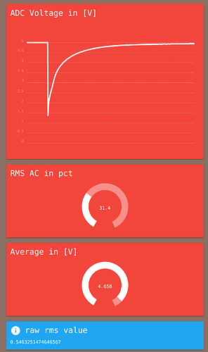
The difference between a Processor Script that runs on Android to visualize a single measurement for the user and the Script running on the web site is that former applies to only one measurement while later applies to a set of measurements.

Processor Script output on Android device (single measurement)

Awesome. I’m going to move forward under the assumption that this will work for the lab application (based on our phone discussion) - it’s going to be exciting to see it all come together, it’s a great application!

PS - @mdc feel free to edit directly, I made that post a wiki so feel free to edit it as needed if you have thoughts / ideas on application and users.

@mdc @david.n.forster here’s my notes, please correct/edit

Talking with Dan and Dave, we discussed the requirements for the Flexible Dashboard in the context of the BFA. Here’s the notes:

Features

  1. Data visualization, for researchers and the public, available on the web in a RFC branded experience. See above post for details on that.
    – Researchers want flexibility in defining quality and what information they display.
    – The public should be provided the most interpretable, relevant information to them. Includes ability to quickly answer questions like “show me the quality of carrots within 50 miles of X location”.
  2. Data anonymization must be implemented side-by-side. However, expectation that all data submitted will be public with identifiable material anonomyzed when requested.
  3. Need terms of service and privacy agreement in place on the website.
  4. Mobile experience will be expanded once we have devices that can deliver real-time results based on lab correlations (2ish years down the road)

Notes

Monetization is a different strategy and would require additional implementation.

Two main constituents:
Researchers - drill down into their data

  • We all feel that we have this down in terms of understand the use case…

Public/consumer - want to see how good this crop is in relation to others

  • will want to find best carrots in a 50 mile radius, sort by region, etc.
  • focused on directing consumption decisions…
  • shareability of the results…
  • don’t need numbers, but need gradation (comparison to others, comparison to standards, etc.)

Like the idea of Dave being a guinea pig as a tech saavy but not full stack developer who should be able to build a nice dashboard for his needs.

There seems to be general consensus that we’re building a visualization experience for the lab data specifically researchers and general public visiting the website on their computers. We still probably want to let people ask questions like “give data about organic carrots within 50 miles” or “give me information about nearby food” etc. Even though it’s not a mobile experience, they still have the same requirements.

David would like the dashboard functionality is built out so that quality can be defined within the dashboard.

Should we have BFA color and scheme for the backend and visualization pieces… where consumers / researchers

Branded experience is more important on the website, less os on the app. So leave the app our sci kit (fewer people will be using it that we don’t know, but 1000s of people will be going to the website to see data overview).

@gbathree some more technical notes regarding how we create dashboards.

As mentioned there are two parts involved in order to display meaningful results inside a dashboard. A researcher or developer who is building a visualization piece (also we are going to call them Macro Script further down the road) needs to keep the following process in mind.

  1. Scoping the data means to select result rows from a single or multiple surveys.
  2. Displaying means to describe behavior of how the selected results are correlated, processed and shown to the user.

Scoping

At one point resulting data is fed into the Macro Script which in turn creates meaningful visualization for the user. The selection of relevant data points could happen either manually by checking boxes in the UI or programmatically with the script choosing which rows to select and dismiss (this would for instance allow only to select data where row.measurement_ground_dry_1.data.absorbance_2 > 0.92). The impact a programmatic selection is causing in terms of server load (while being very flexible and thus certainly a favorable solution) would likely be significant, however testing will show how feasible it would be.

Displaying

The input of the Micro Script could be following:

var scope = {
  "build_MSU-Soybean-JD_1512495199": [
    {
      "metaDate": "2017-12-15T12:22:12.113-08:00",
      "metaInstanceID": "uuid:76f18e00-6a69-4055-97e6-1e91d9442e65",
      "metaUserID": "TTL9VKM5EsQXmizM0NdDVYk125",
      "sample_id": "201601014",
      "field_quality": "bad",
      "total_carbon": "0.62125",
      "measurement_ground_dry_1.data.median_0": "44.1968",
      "measurement_ground_dry_1.data.median_raw_5": "15893.1",
      "measurement_ground_dry_1.data.absorbance_2": "0.962271"
    },
    {
        "metaDate": "2017-12-15T12:22:13.113-08:00",
        "metaInstanceID": "uuid:76f18e00-6a69-4055-97e6-1e91d9442e66",
        "metaUserID": "TTL9VKM5EsQXmizM0NdDVYk125",
        "sample_id": "201601014",
        "field_quality": "bad",
        "total_carbon": "0.62125",
        "measurement_ground_dry_1.data.median_0": "44.1968",
        "measurement_ground_dry_1.data.median_raw_5": "15893.1",
        "measurement_ground_dry_1.data.absorbance_2": "0.962271"
      },
      {
        "metaDate": "2017-12-15T12:22:14.113-08:00",
        "metaInstanceID": "uuid:76f18e00-6a69-4055-97e6-1e91d9442e69",
        "metaUserID": "TTL9VKM5EsQXmizM0NdDVYk125",
        "sample_id": "201601014",
        "field_quality": "bad",
        "total_carbon": "0.62125",
        "measurement_ground_dry_1.data.median_0": "44.1968",
        "measurement_ground_dry_1.data.median_raw_5": "15893.1",
        "measurement_ground_dry_1.data.absorbance_2": "0.962271"
      }
  ]
};

Visualization would then happen like this:


// creates a plot with date as X axis and absorbance value 2 of ground dry measurement as Y axis
// Span 2 row cells in the dashboard (3x3 dashboard by default)

ui.plot(scope, "metaDate", "measurement_ground_dry_1.data.absorbance_2", 
   "Absorbance for " + scope.length + " measurements", 2_WIDE);

// creates a box with information about the average
// Span 1 row cell in the dashboard

ui.info("Average Absorbance", avg(scope, "measurement_ground_dry_1.data.absorbance_2", 1_WIDE));

// call an API from the client to add contextual information based on geolocation
// Span 3 row cells in the dashboard
http.get("http://api.supersoilapi.org/valuesforlatlon?lat=20&lon=20").then(function(res){
    ui.info("Soil types", res, 3_WIDE);
});

Of course this is just a very roughly outlined example of how the Macro Script would work.

Identically to the Micro Scripts (Measurement Scripts) which run on the Android device, the Macro Scripts are developed offline with an editor (recommendation is vs code).

One key piece for developing is having data that makes sense, which is why the web application would allow for downloading selected rows of a survey as JSON file. This allows easy import into the development environment.

After the script has been debugged and tested, it is then uploaded to the web application, where it can be applied to different selections of data rows.

In order to prevent problems in case scripts are applied to surveys that do not fit the data model expected by the JS code, a manifest.json file will describe to the web application to which surveys the script is applicable and thus limit issues with incompatibility.

Yep Yep - nice outline. I’d also add that the high server load from a script-based scoping mechanism may be addressed by using a distributed file storage system like IPFS in the future. So by avoiding lots of complex ways (caching etc.) to minimize traffic today, we believe that IPFS will solve the problems associated with that in the future.

@gbathree @david.n.forster currently we are working on a wireframe for the ui, keeping in mind the first set of use cases of the user story.

Have a look at the draft (in svg format) over here

Meanwhile we will be working on other parts of the UI/UX.