notes from @mdc and Greg 2/9/18 -->
Data comparability first
We realized that in order to visualize multiple surveys in the same location and get the user what they expect (maximum overlap between similar questions), first we need to get users to utilize the same surveys, groups of questions, or individual questions. Questions in ODK are identifiable by question ID, so that (along with question type and script ID for measurements) are great ways to match comparable information from two surveys.
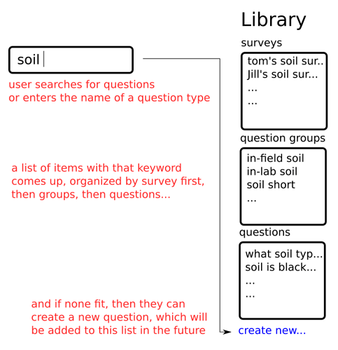
Kobo Toolbox is already at the beginning stages of sharing surveys, groups, and questions… so we’re going to assume we’ll use their functionality to maximize overlap of similar questions throughout the community. When creating a survey or question, we’ll provide an organized list of similar questions to help direct users to similar work, increasing comparability before the data is collected. Here’s a rough outline of how that would work.
Then filtering…
Filtering in this discussion is focused around filter by date, user, and survey. Ideally, filtering would happen in two locations:
-
When the user is selecting the surveys/data to visualize. It’s required here because there may be very very large surveys that the user couldn’t feasibly download all of… so they’d need to be able to select by date and/or user.
-
When the user is viewing a dashboard. Often, the desire to filter happens in the context of information you gain by looking at a dashboard. From a usability perspective, this would be very helpful though not technically required, as they user can always ‘go back’ and change the filter at the previous step.
Easy Dashboard Functions
First - are we positive we can’t do this with existing libraries? Plotly, http://rawgraphs.io/, … others?
As with the script tools ui.info or ui.warning simplified functions, we’ll have a similar set of functions for the dashboard. The selection of these easy functions should overlap as much as possible with the demands of our initial users, and the likely typical demands of future users.
Proposed list:
- Select - a dropdown selector of the available measurement data and survey questions. The selected output is available later in the script… so I could call a histogram and reference it, for example. When the user selects it, the histogram auto-updates according to the users selection.
- Summary - show the average value,median value, min, and max. For categorical, show # of unique answers… a brief list of most typical… maybe something else?
- Histogram - a histogram, pretty self-expalanatory. If categorical, show a bar plot with each answer (“yes”,“no”,“maybe” for example) on the X and the number of entries on the Y.
- Data by time - the date on the X, and the data on the Y, as scatterplot. Show “cannot display data for categorical data” error if categorical.
- X - Y scatterplot - two selected variables on X and Y, and an optional “BY” variable which sets the series… so for example, plot numerical variable A on X, numerical variable B on Y, BY categorical variable C. A linear fit option would be nice but not required.
- Merge - merge multiple surveys by question id, question type, and script id. We will need to make assumptions during merges, if people want to do more complex merge’s they can do it manually.
- always show total columns and columns successfully merged
- Filter - dropdown or similar ui to filter by date and by user.
Additional notes -->
- On all visualizations (histogram, x/y, correlation), because we’re pulling from multiple sources and there will likely often be issues with missing data, ALWAYS show something like “showing XXX or YYY data points” so users are informed. Otherwise there will be confusion of what they are seeing, and misinterpretation of data will happen.
- most functions will need to recognize if a variable is categorical or numerical, and display the differently. So we’ll need a very robust identifier for that, for example, NA values should not trigger categorical if everything else are numbers

- all functions will need to have limits - so don’t make a bar chart with 1000 categorical variables in it… that’ll blow up the persons computer… Or if user wants download > 1000 data points, they should be informed.
Default dashboard
I’m out of time, will work on this monday.

